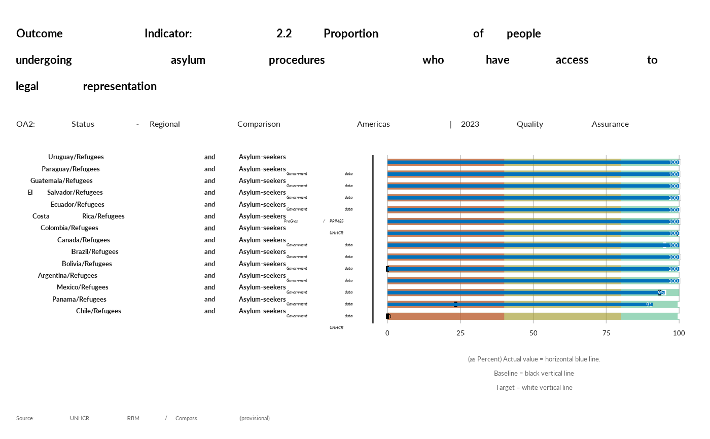
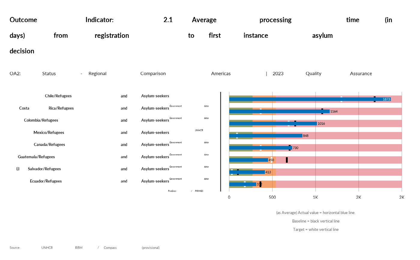
In a Bullet Graph, the main data value is encoded by length with the bar in the centre of the chart, which is known as the Feature Measure. The line marker that runs perpendicular to the orientation of the graph is known as the Comparative Measure and is used as a target marker to compare against the Feature Measure value. So if the main bar has passed the position of Comparative Measure, you know you've hit your goal.
See https://datavizcatalogue.com/methods/bullet_graph.html The segmented coloured bars behind the Feature Measure are used to display qualitative range scores. Each colour shade (the three shades of grey in the example above) are used to assign a performance range rating. So for example, poor, average and great. When using Bullet Graphs, it's ideal to keep the maximum number of performance ranges to five.
Examples
data <- prepare_qa_data(activityInfoTable= "cdn6y40lm87wi522")

thisind <- "OA2-2.1"
rbm_bullet(data, thisind)[["plot"]]


thisind <- "OA2-2.2"
rbm_bullet(data, thisind)[["plot"]]
thisind <- "OA2-2.2"
rbm_bullet(data, thisind)[["plot"]]